News and Events
Refreshed and Ready for Growth
May 20, 2020
BNI is introducing a fresh and exciting new look designed to help you grow your business. The BNI brand has been completely refreshed with a new logo, colors, graphics, images and copy. There is fresh a new website, social media, videos, chapter branding materials, promotional items, PowerPoint Templates, Email Signatures and more!
The refresh of BNI started two years ago with one objective, improve the relevance and attraction of the brand to help members grow their business. After months of research exploring industry design best practices, reviewing the competition, understanding color theory, and designing hundreds of BNI logos, the bold red new BNI logo was born. Its distinctive red attracts more than any other color and promotes leadership, confidence, energy and courage. The eye-catching and memorable font provides a professional, yet simple and friendly appearance. The diagonal white line across the “I” symbolizes the Member’s professional and personal growth. The BNI logo can be featured in red or white and will be complimented with black and grey for a contemporary image.
BNI’s fresh new look will help increase referrals by attracting new Members to your chapter. More Members means more referrals, sustainable business growth and an optimistic future. You are encouraged to fully leverage the refreshed BNI brand and all the all the features that BNI has to offer.
Please visit bnibranding.com to access all of the new branding tools available to you.
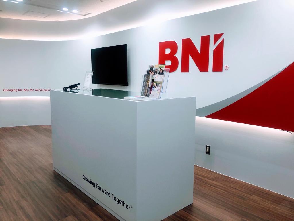
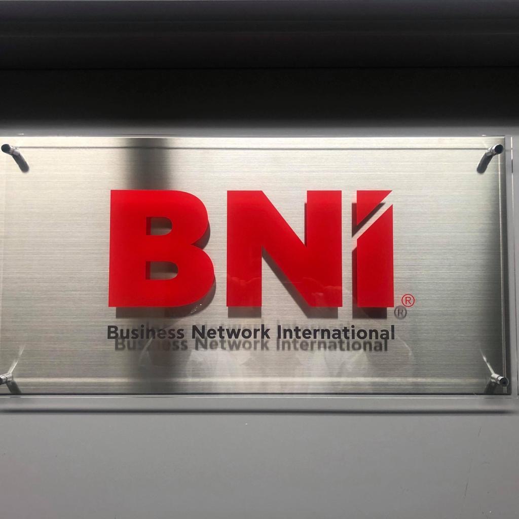
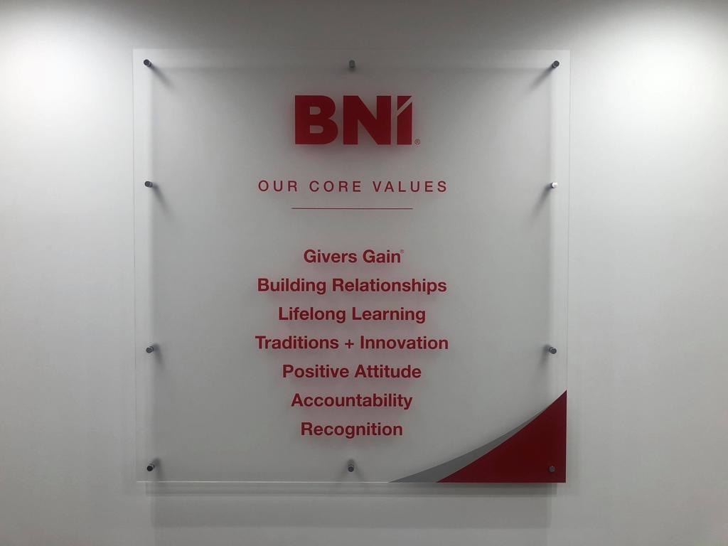
Additionally, please check out our brand in action with these images from Team Japan’s national headquarters.
Growing Forward Together
Recent Posts
How Building Relationships is a Game Changer for Business Success in 2025
February 17, 2025

Experience the Power of referral networking in action
Get Invited


